Our Business Verticals

Business Design

Business problems, analysed strategically and solved through brand solutions built to scale.

You are here

Mellow Films

AI films and photography built to scale D2C brands without scaling the cost.

Explore
Explore

Mellow X

UI/UX and websites designed for how brands work in the AI era

Explore
Explore

Mellow Staffing

Creative talent tested on real-world briefs and matched to the teams that need them.

Explore
Explore

Our Brands
Our Brands
Mellow Films text logo in a bold and modern font on a transparent background.
Millet Home Logo

Millet Homes

Changing perceptions about a healthy breakfast brand.

Services

Brand Identity
Packaging
Marketing Campaign
Brand Design System

The brief

Challenge

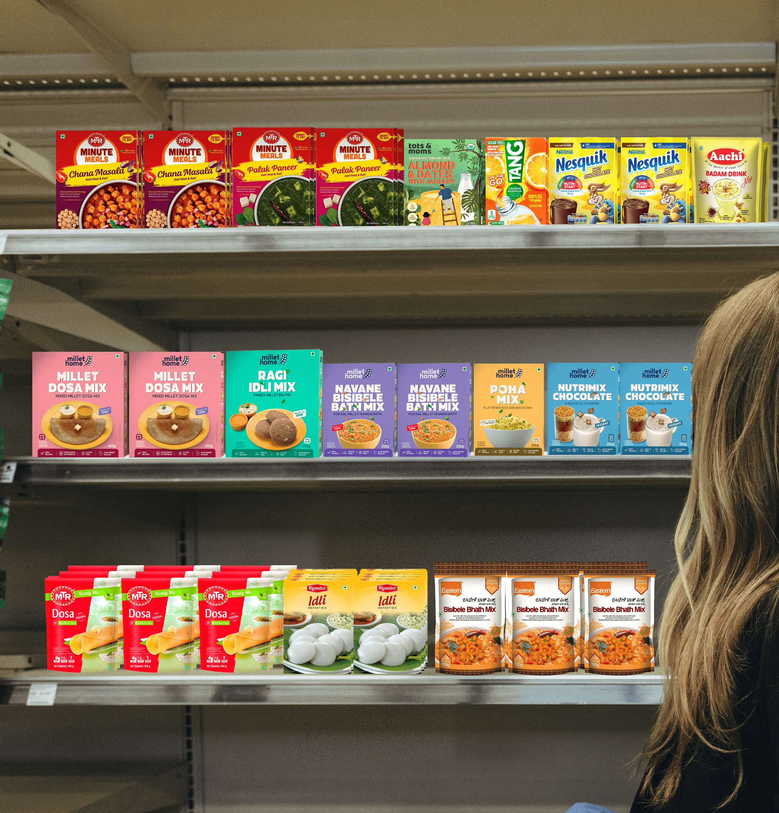
Millet Home aimed to promote healthy eating with 100% organic, preservative-free ready-to-eat foods. However, competitors targeted only older generations, overlooking the growing demand for organic food among younger audiences. Millet Home needed a fresh visual identity to appeal to this younger demographic.

Approach

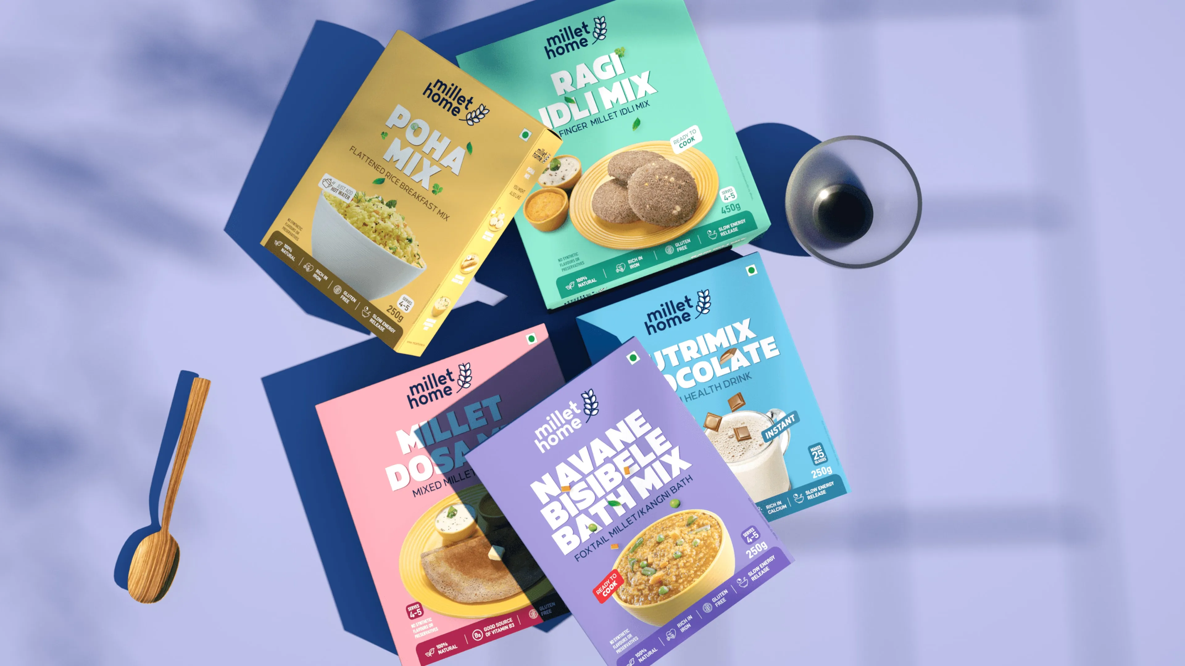
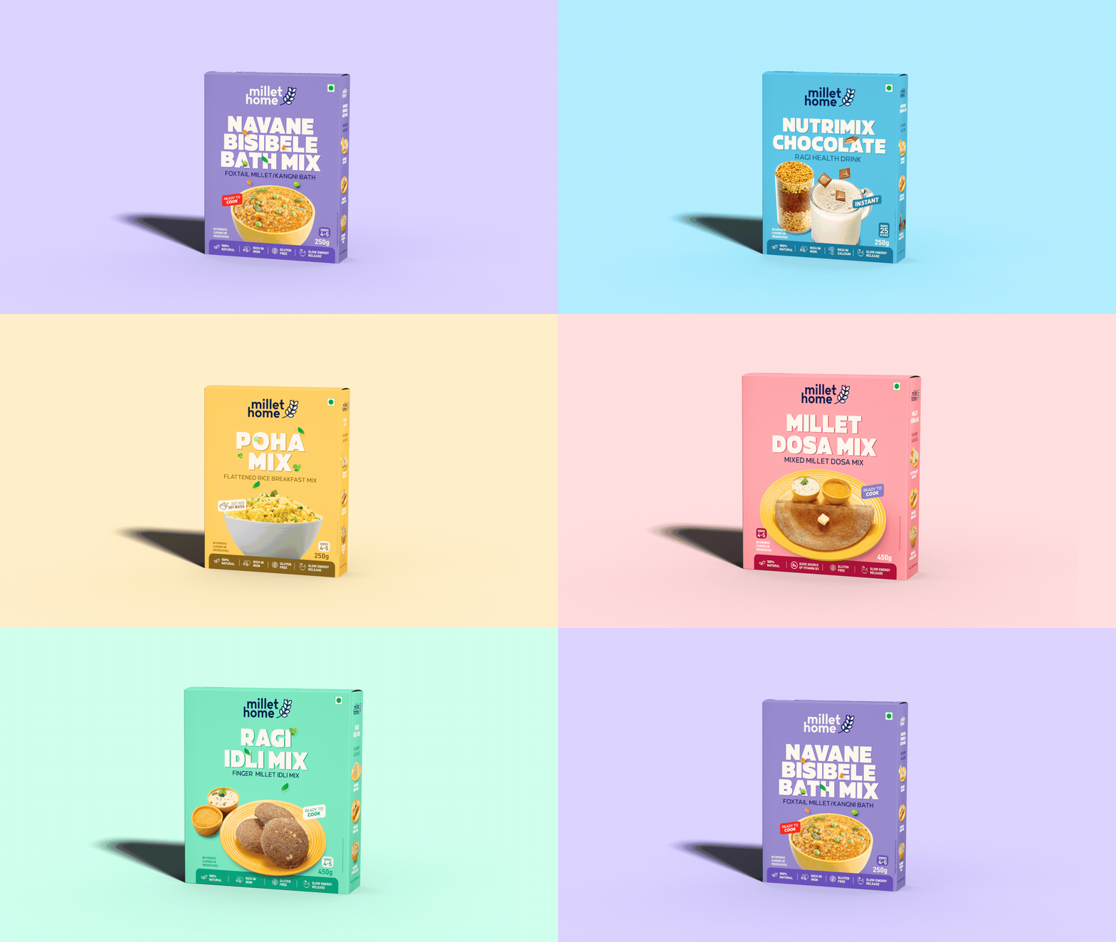
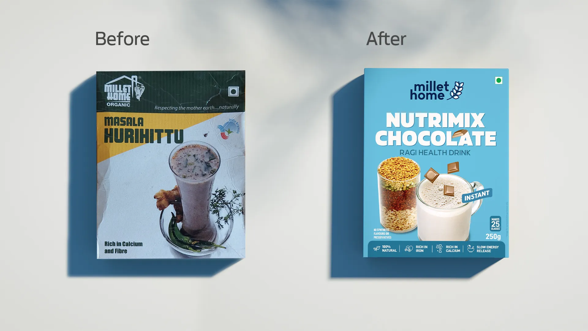
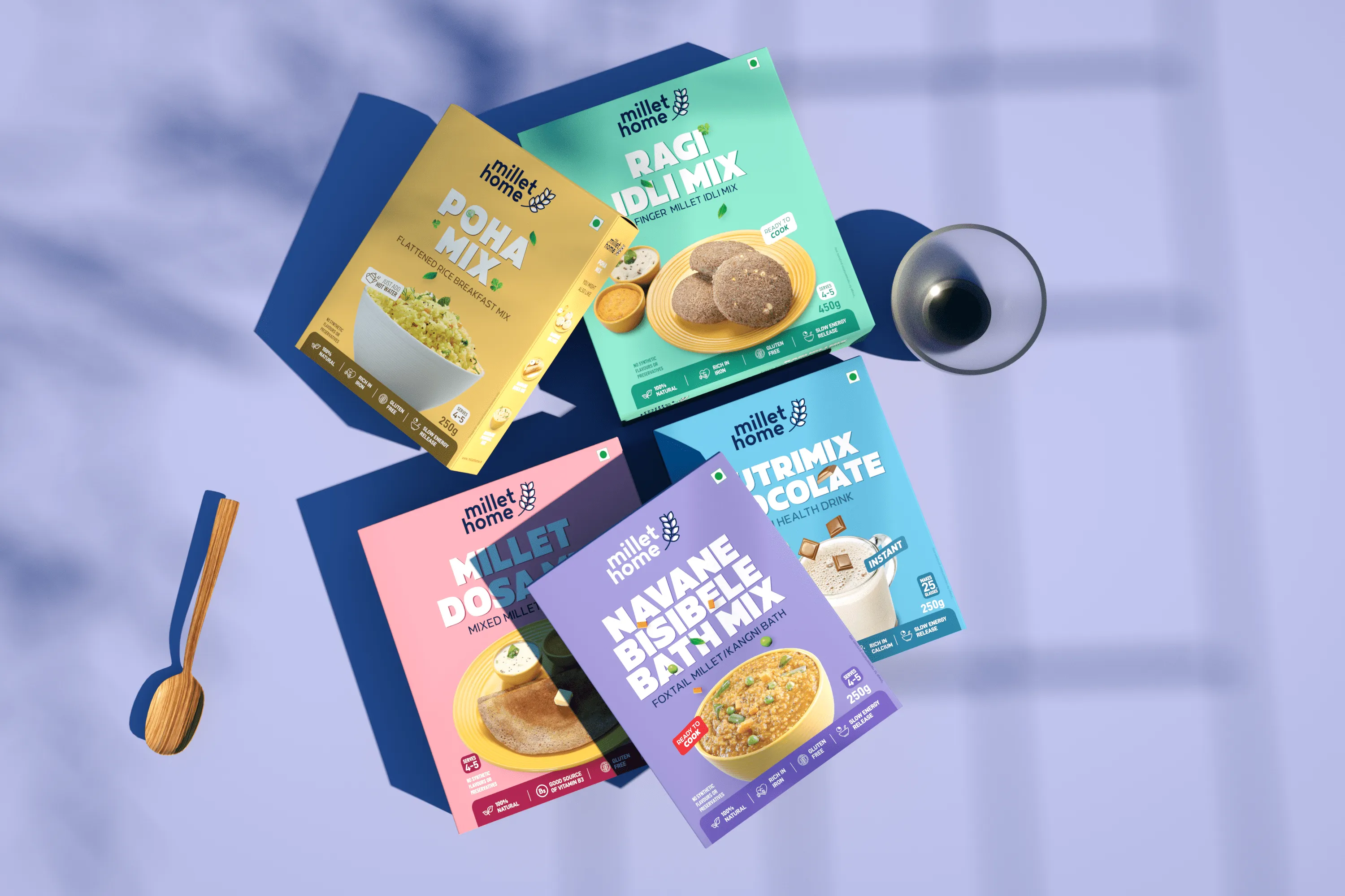
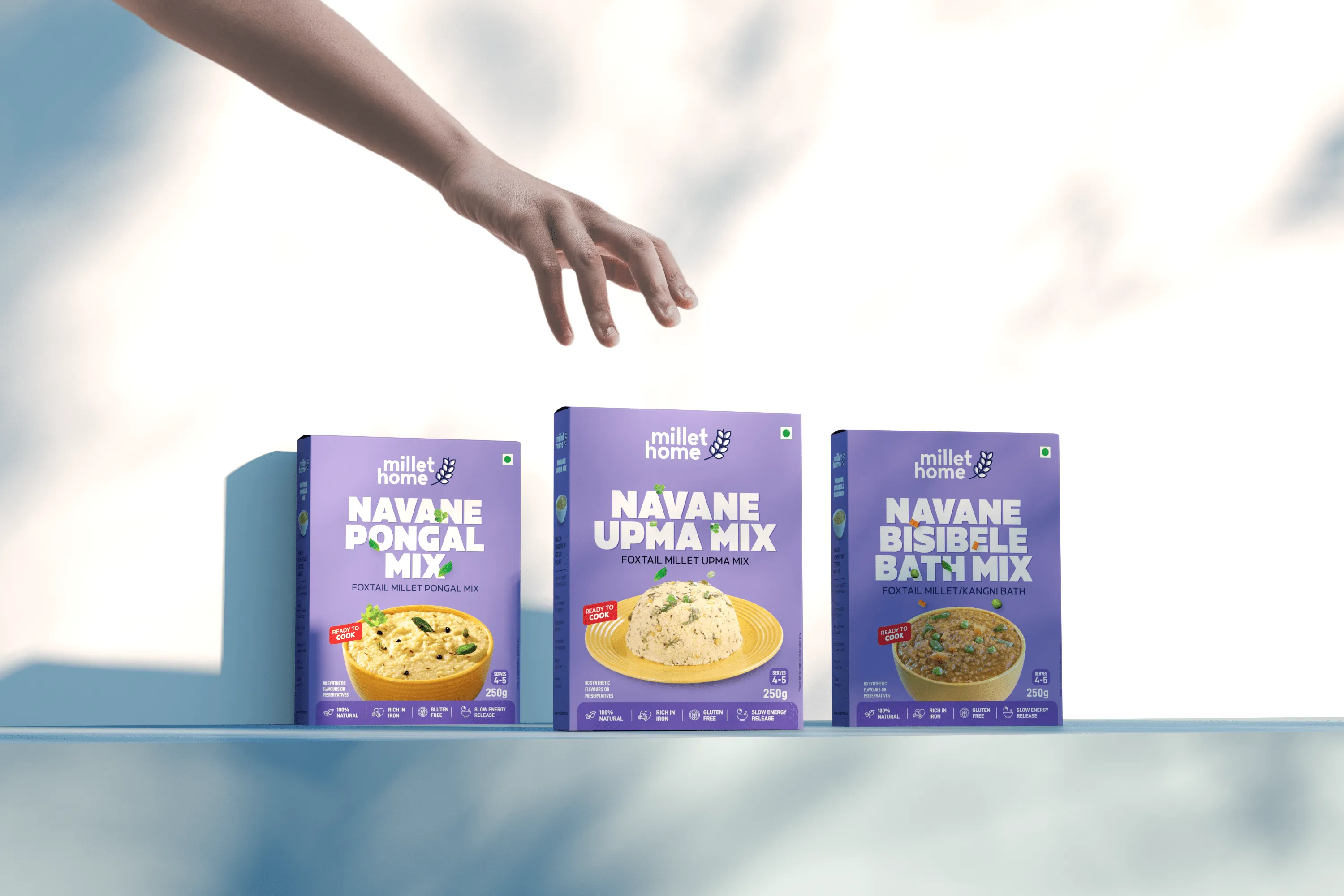
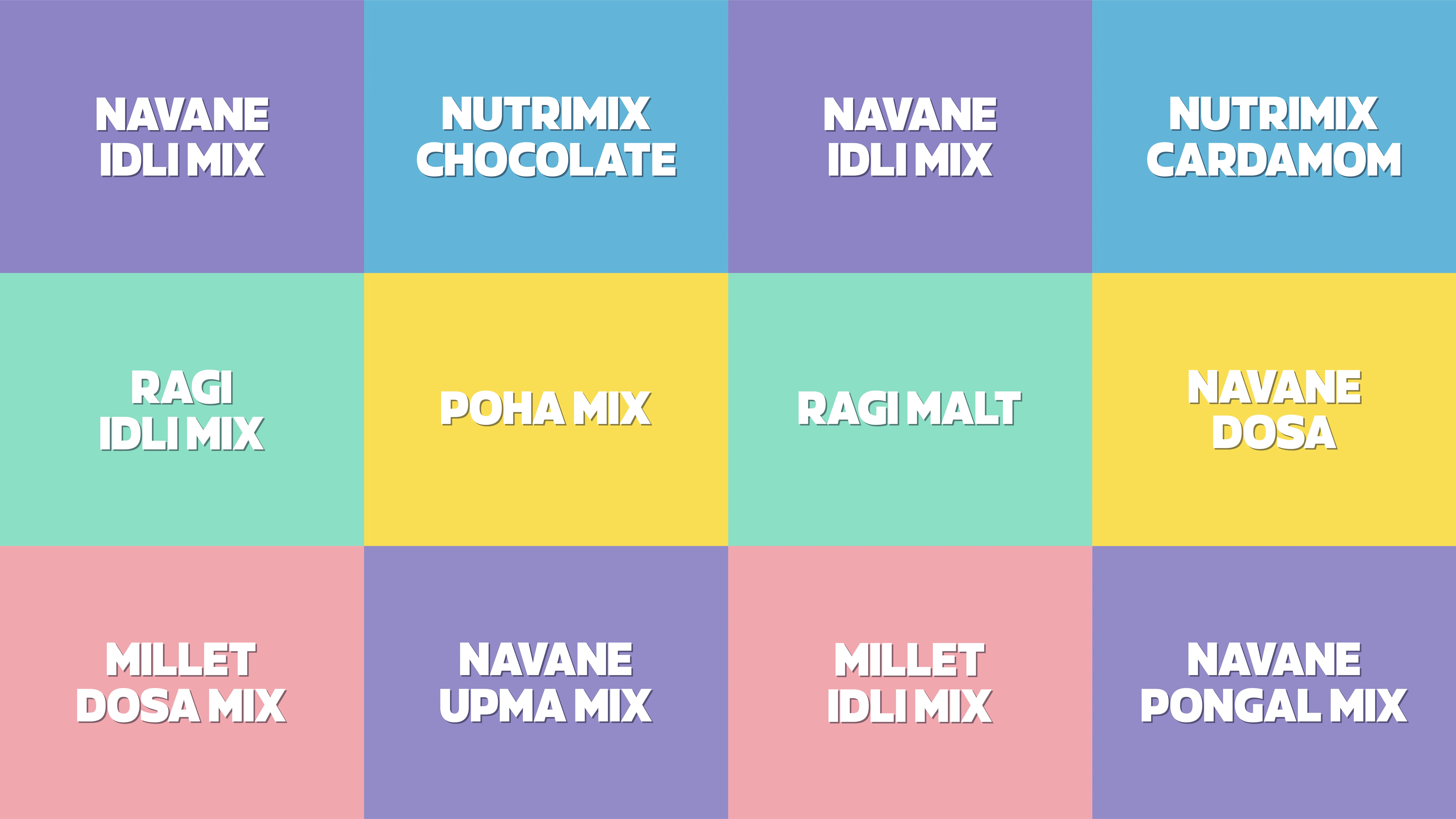
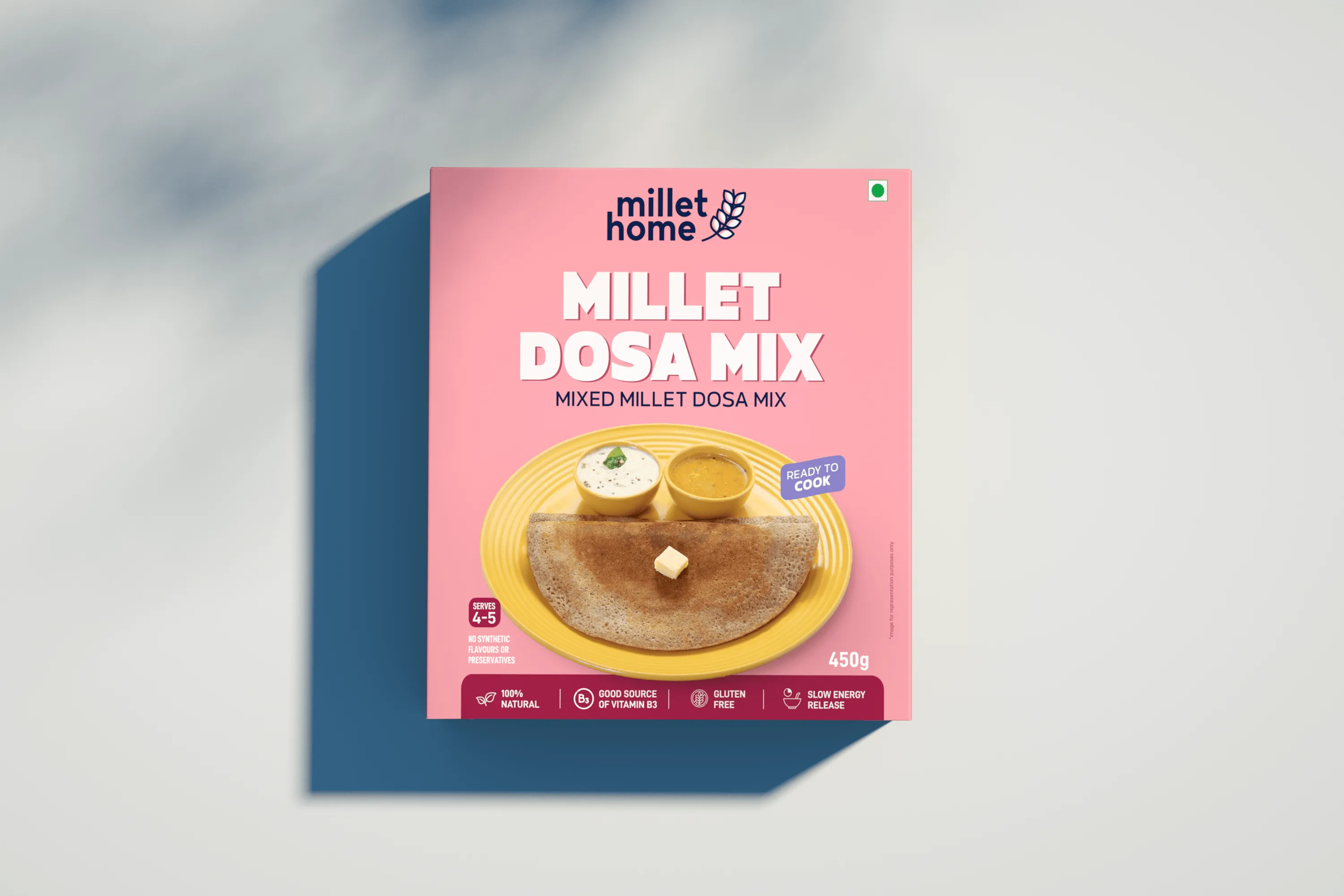
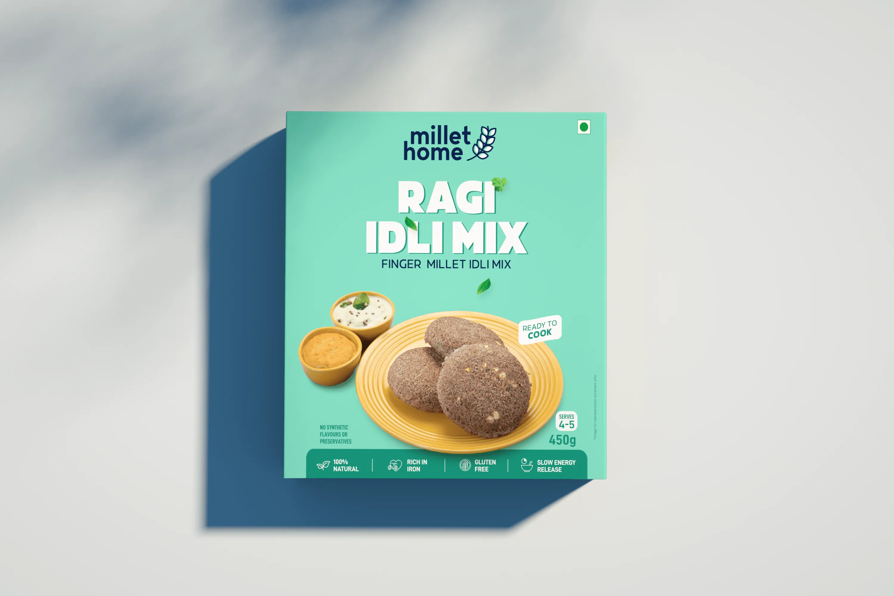
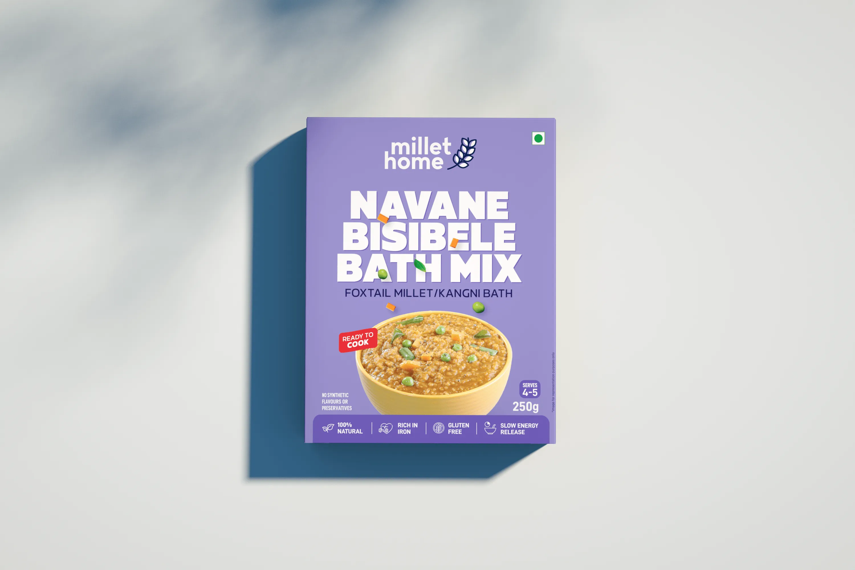
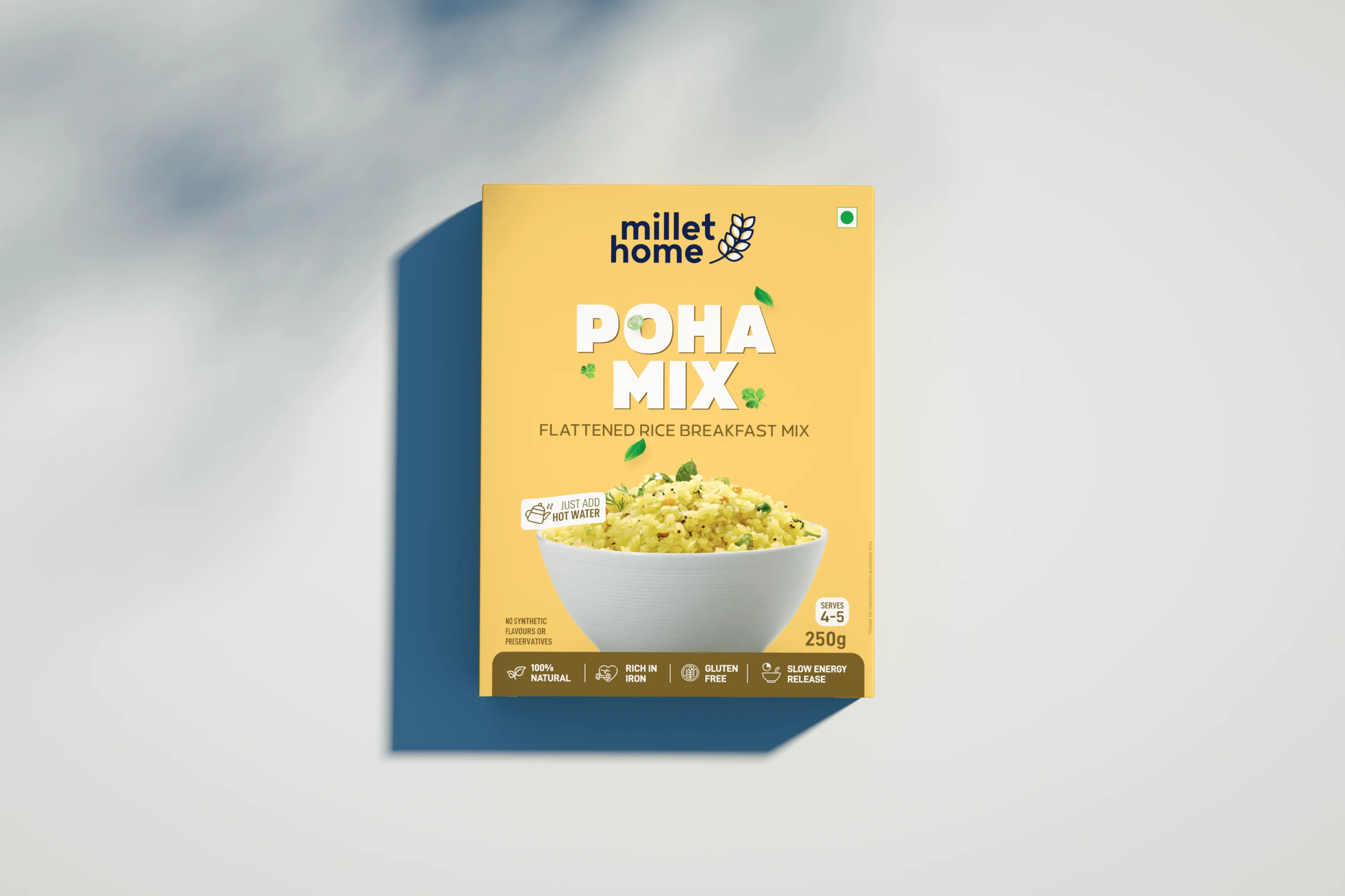
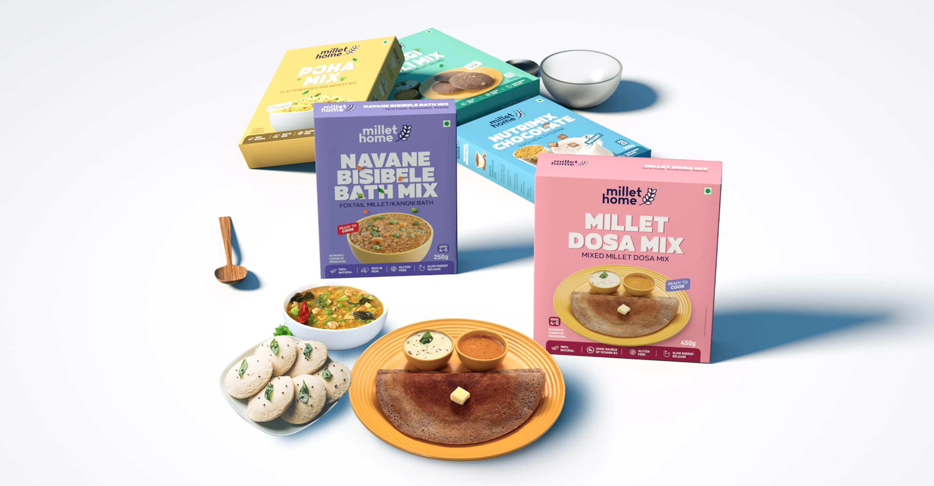
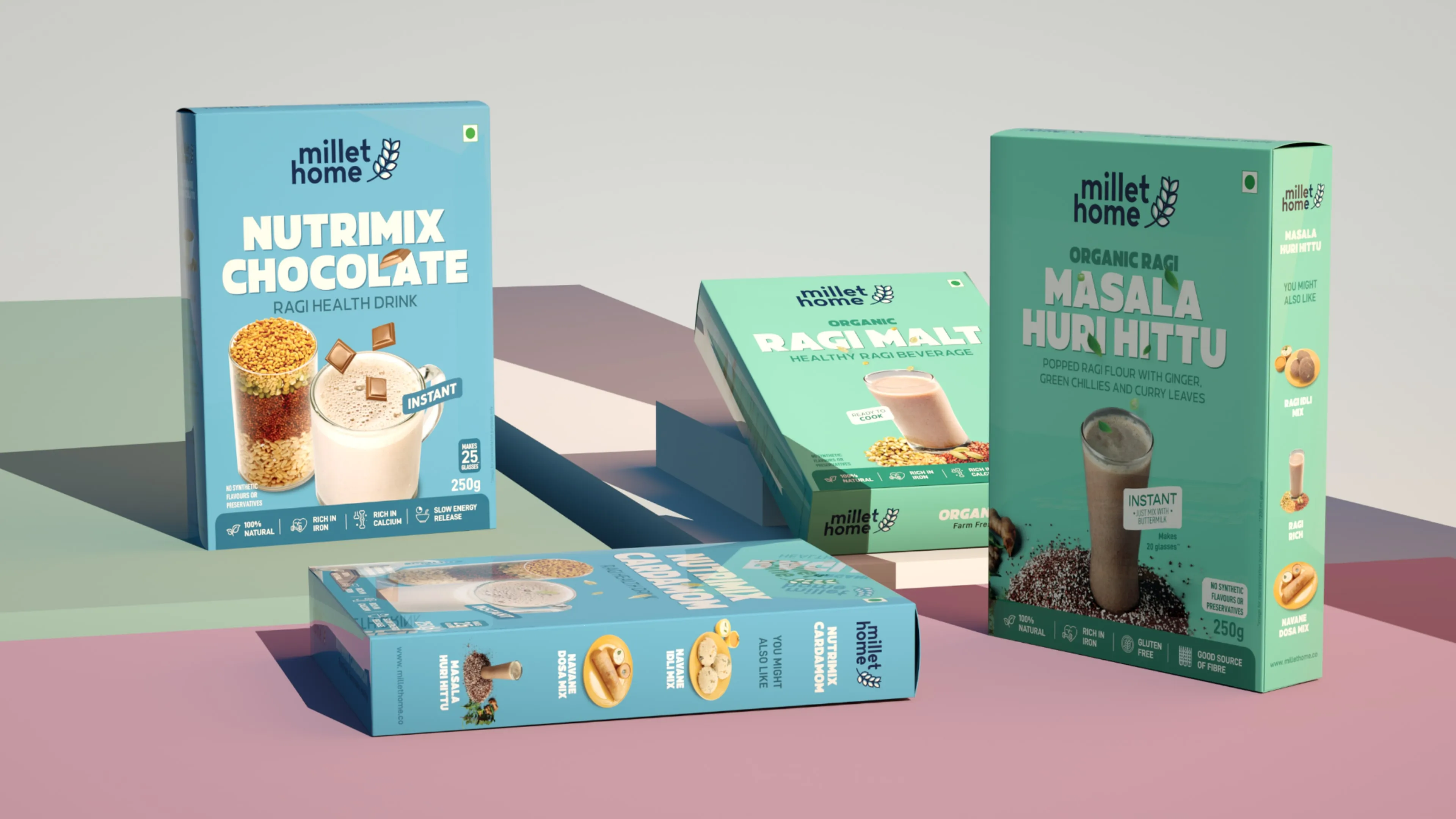
Mellow Designs crafted a vibrant and youthful identity by designing packaging that placed key product highlights at the forefront. We used bright, peppy colours and modern typography, positioning the product name prominently to capture attention. Updated product photography further reinforced the brand's fresh and modern appeal.

Result

The new visual identity successfully attracted a younger audience, enhancing brand recognition and driving higher engagement with Millet Home’s products.

No items found.

Frequently Asked Questions

Is the organic ready-to-eat food market saturated?

Only at one end of it. The category is crowded among older consumers, but we identified a clear gap for Millet Homes in serving younger, health-conscious buyers that existing competitors had not addressed.

How do you reposition an organic food brand for younger buyers?

Design for the audience competitors skipped. We built Millet Homes' branding to shift the perception of organic ready-to-eat food toward a younger, health-conscious audience rather than the older demographic the category defaults to.

What does branding for a preservative-free organic food product need to communicate?

Two things at once. Millet Homes' branding had to make the 100% organic, preservative-free credentials unmistakable while still appealing to a younger buyer who avoids traditional health food cues.

How do you change perceptions of a category seen as being for older people?

Change the visual language before the claims. We built Millet Homes' identity to make organic ready-to-eat food read as relevant to a broader, younger audience rather than a legacy health food shopper.

Should a food brand run different branding for different age groups?

One identity, built to bridge. We positioned Millet Homes with a single identity designed to close the gap competitors left open, rather than maintaining separate brand expressions per age segment.

Next Project

Next Project
Pause icon with two vertical white bars on a black square background.
Mellow Designs
Online
Hi there,
Ready to turn ideas into something awesome? How can we help you?
Start Whatsapp Chat
Chat on Whatsapp
Your brand’s success story starts here
Let’s Begin
Lets Begin