Challenge
The traditional recruitment process is stuck in a rut. Résumés are often overinflated, skills gaps go unnoticed, and the entire system can feel impersonal and outdated. Skyl, a forward-thinking hiring portal with a focus on upskilling, needed a website that reflected their innovative approach and attracted both top talent and employers seeking a more dynamic recruitment experience.
Approach
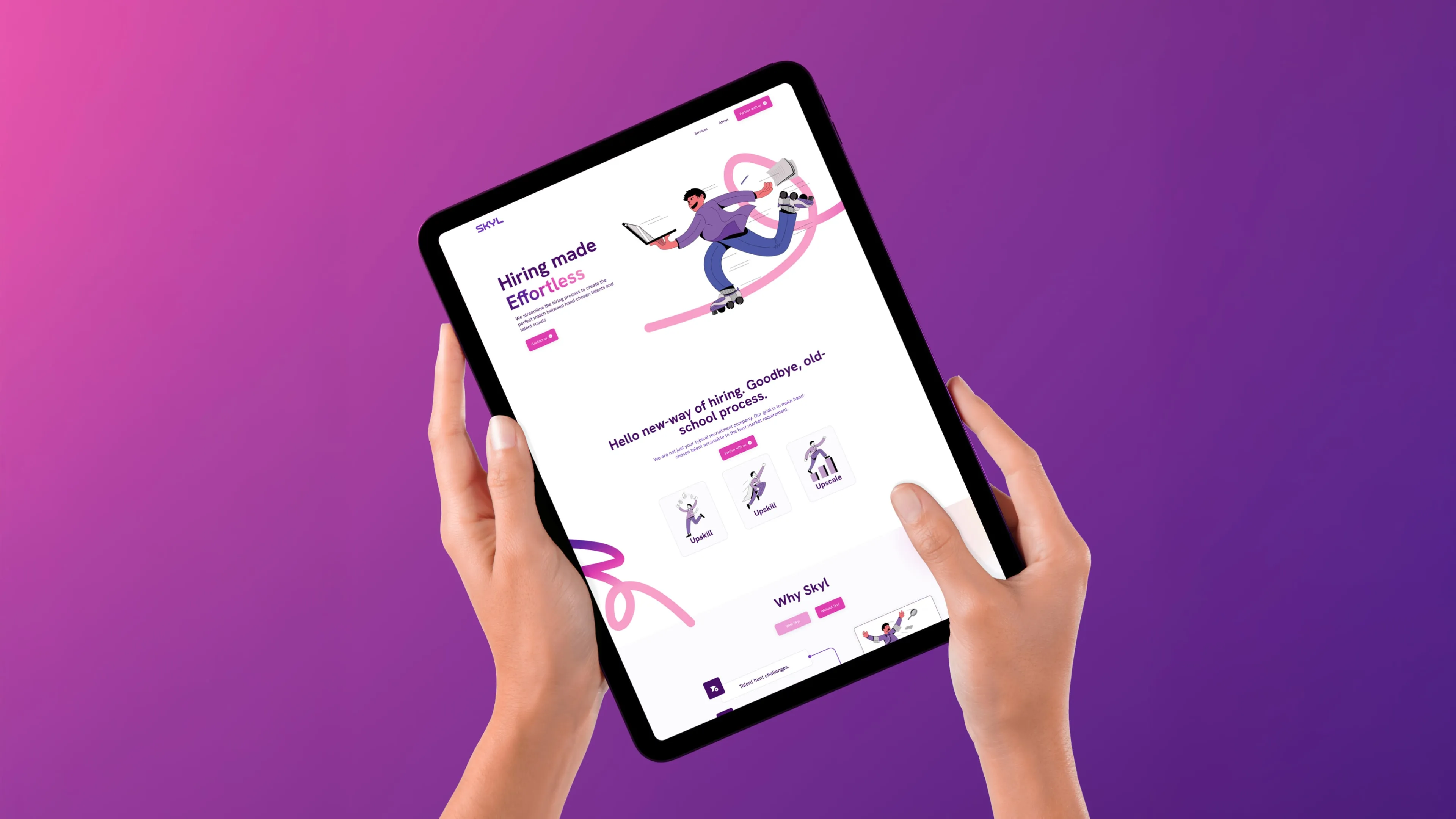
We designed a stunning, user-friendly recruiting website that prioritised clarity and functionality. The focus shifted from traditional résumés to showcasing a candidate's skills and potential for growth. We ensured that the website is able to connect candidates with relevant training and resources to close any skill gaps and prepare them for their dream job. Appealing art direction and intuitive navigation created a welcoming and engaging experience for both job seekers and employers.
Thought Process
The website design prioritised clarity and user-friendliness. We understood that both candidates and employers were looking for a more efficient and engaging experience. By focusing on skills assessments and upskilling pathways, we created a platform that empowers candidates and helps employers find the perfect fit, regardless of traditional qualifications.
Result
The new website was a resounding success for Skyl. User engagement increased significantly, with a notable rise in both candidate and employer registrations. Traffic data showed a strong interest in Skyl's upskilling programmes, and the platform received positive feedback for its user-friendly design and informative content.


